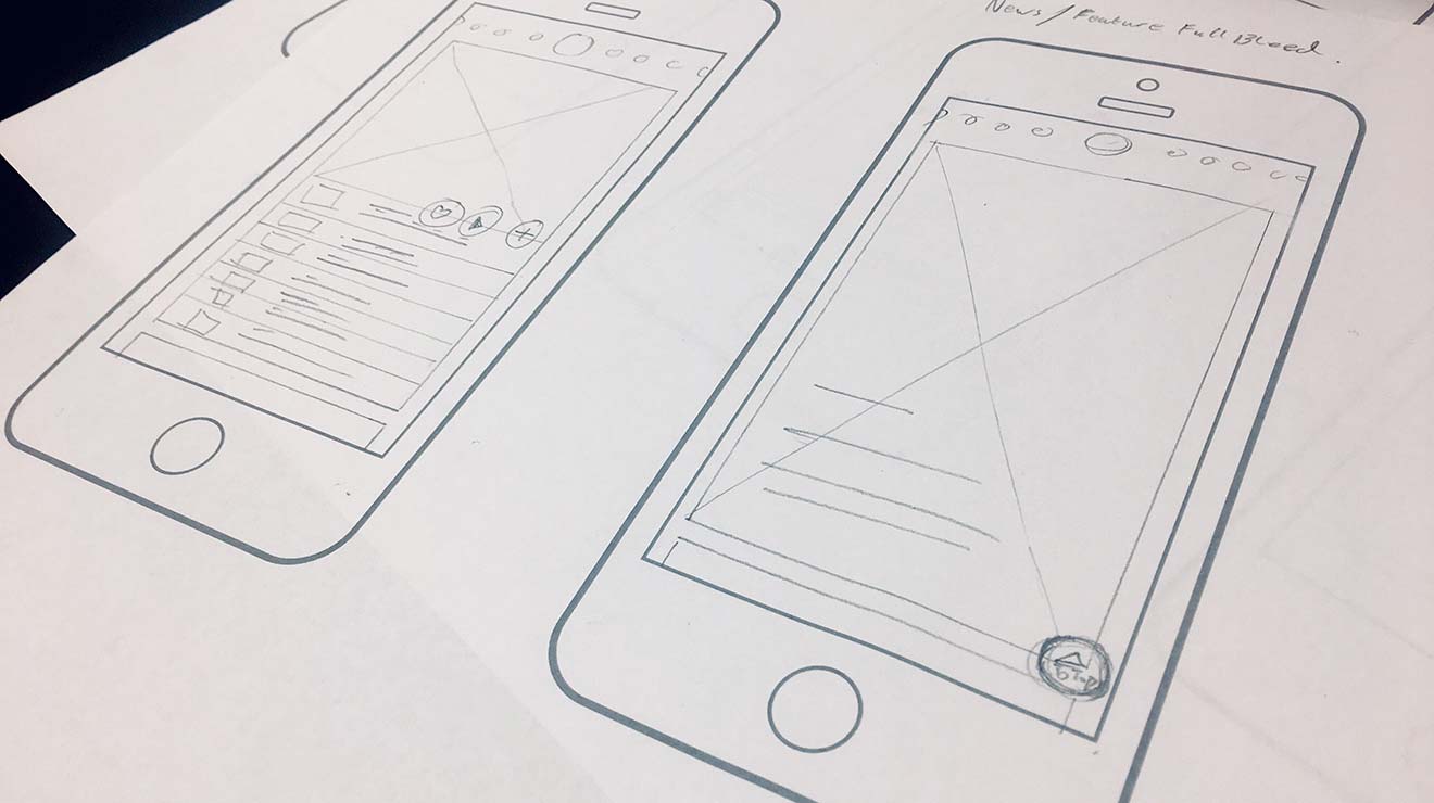
There’s a concept in typography that I keep coming back to. Designing with a grid is what many of us would consider a first principle. Just not one that’s set in stone.
In fact, once you’ve fully learned how to utilize the typographic grid, you’re strongly encouraged to learn how to break it. Something you will need to do on a regular basis.
The point is, you learn the grid so that when you break it, it feels deliberate. Not as a mistake. Not as ignorance, but as an informed choice.
I think about Human-Centered Design (HCD) the same way.
Sometimes it feels like the process is taken as gospel:
- Empathize
- Define
- Ideate
- Prototype
- Test
It’s on posters and job descriptions, and it’s very often the answer junior designers give when asked how they work. And to be clear, the process certainly isn’t wrong. But the process without the underlying principles is just a checklist. You can run every step and still produce something that fails the person you were supposedly designing for.
So what are the actual load-bearing walls?
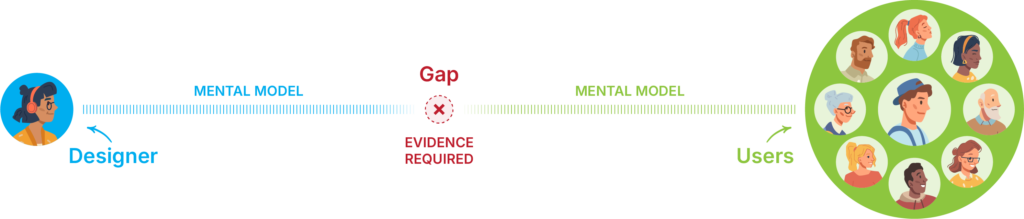
The user is not you
Also known as the false-consensus effect:
People’s tendency to assume that others share their beliefs and will behave similarly in a given context.
This may sound obvious until you watch someone override a universally recognized UI convention just because they personally don’t like it.
Many years ago, I had a project manager tell me she didn’t care for the color I’d used for tooltips. Which happened to be the universally recognized color for tooltips at the time. Why? Because, according to her, “it was an ugly color.”
Your taste, your preferences, your intuitions about what’s obvious are all contaminated by your own mental model. The entire discipline exists because that gap between designer and user is real, persistent, and cannot be bridged by assumption.
Context is the unit of meaning
A feature isn’t good or bad in the abstract. It’s good or bad for a specific person, doing a specific thing, under specific constraints. Strip the context and you’re designing for a fiction you invented (hence the importance of research).
People are often poor at prescribing solutions, but highly reliable at identifying friction
Aspirational self-reporting is notoriously unreliable. Indeed, according to the NN/g, human memory is flawed, and self-reporting is often filtered through aspiration, identity or social desirability. What people say they do and what they actually do are frequently not the same thing.
Therefore, observed friction is where the money is. This is why “watch what they do, not what they say” survives every methodology shift, every new framework and every rebrand of the discipline.
It also means that feedback on a finished design is not research. I’ve had this argument more than once. “Once the design is done, we’ll show it to users and see what they think.”
Oh, darling… no.
That’s a vibe check. Users may tell you they don’t like a button. But can they tell you that what they actually needed was to never reach that screen in the first place?
For that, you needed to be watching earlier, upstream, before the design ever came into existence.
Iteration is epistemology, not process
You’re not iterating because it’s best practice. You’re iterating because your first model of the user’s reality is likely wrong. Or at best, incomplete. The only correction mechanism is contact with actual use. Some people do get it right on the first pass. Sure.
But you shouldn’t architect a methodology around the assumption that you’ll be one of them.
Design changes behavior, which changes people
This one is all too often misunderstood. We tend to think of design as a response to human behavior: you study how people cognitively process the world around them, and you design accordingly. But the relationship runs both ways.
Design shapes behavior. And behavior, over time, becomes expectation. Which then shapes what future designers treat as given.
Navigation at the top left of a webpage isn’t there because it’s intuitively obvious. It’s there because enough people put it there in the early days of the web, users learned to look for it, and it calcified into convention.
The hamburger icon on mobile followed the same path, a pragmatic solution to a new constraint that became, through sheer repetition, something close to instinct.
This matters because it means you’re never just solving for today’s user. You’re potentially contributing to what tomorrow’s user will take for granted.
The untrained eye breaking a grid just looks like a mistake, like handing editing software to someone unfamiliar with the rules.
The trained eye breaking a grid is making a different kind of call entirely. Not a statement or provocation, but an insightful diagnosis, one that can confidently say “This approach isn’t serving the work or the user. I know why it exists, I know what I’m trading away by leaving it, and I know this is better.”
That’s the knowledge the process can’t give you on its own. The checklist tells you to use the grid. First principles tell you why. And when you understand why, you can make the call to deviate.
Not to defy convention, but because you’ve acquired the knowledge and experience to know when convention isn’t the answer.
This post was co-written with Claude ai and ChatGPT to refine ideas, structure arguments, and enhance clarity.